Plotting large climate data interactively
Climate data can be large. Not just climate data, similar datasets – satellite remote sensing, lidar, model data - all can be large, and difficult to work with, including visualizing them performantly. In this project, I explore different ways to visualize large data, with the goal to let users interact with the underlying large dataset in a performant way.
So you want to let the world interact with your cool dataset?
A significant chunk of the scientific community now deals with large datasets. If you’re a climate scientist, working with remote sensing datasets, or computing vision datasets, you must have come across the hurdles that go along with working with large datasets. Not only processing these datasets can be difficult, visualizing them also poses significant challenge.
When working with visualizing large datasets, it is common to wait several seconds, if not minutes, for a plot to render. Our brains used to instant feedback from our digital devices is instantly bothered by such a lag. How can we then let users interact with it - pan around, zoom, click, and all such fancy manuvers – while still ensuring performanece?
This article will demonstrate a few ways in which this can be achieved.
But first, let’s define the problem statement.
Problem statement
We want to build a dashboard for a large dataset.
- The dataset is in raster format.
- The visualization will be accessed by target users through a browser.
- The users should have the ability to pan around, zoom, and click (to perform some additional action, such a visualize in a separate dimension).
Server and Client
The first concept required to be understood is that of the Server-Client relationship.
Server is a computer that “serves” the data, can be thought of as the “supplier”. This is the computer (or a bunch of computers) that supply the data, or the visualization, or compute for the visualization.
The Client computer is used by the user to “consume” the visualization. The client will access the visualization using a browser.

Strategies to visualize large data
We’ll be using the CESM-LENS2 dataset. It is an ensemble (has several model runs with slightly different model initializations) climate model with historical and future predictions. Consequently, the dataset is very large, ~1.8 TB in it’s raw form. The first strategy to employ for visualizing the data is to reduce it’s size as much as possible.
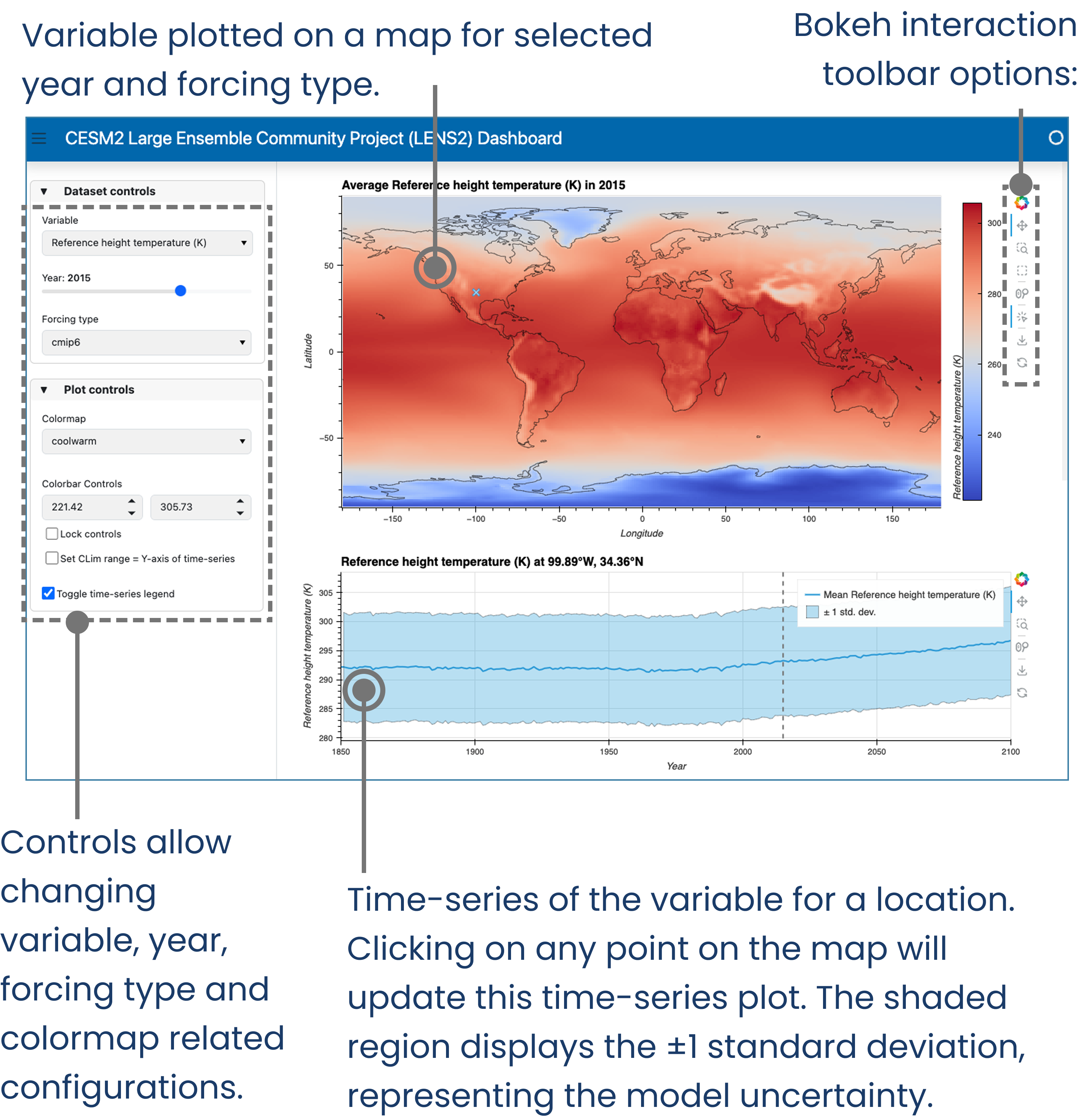
Let’s define some visualizations we’d like to make with the dataset. We’d like the users to view the average value of the ensembles and its spread, as a map. The user would be able to pan and zoom around this map. The user would also have the option to select different variables to be plotted. Additionally, for bonus point, we’d also like to add the ability to click on a point in the map and plot the corresponding time-series for that point.
To perform these visualizations, we can get away with reducing the ~1.8TB dataset into two datasets, one of the mean and the other standard deviation across the ensemble members. This can be done using a combination of xarray, and Intake-ESM. This articles does not discuss this operation in detail, rather, the reader is guided towards Project Pythia’s CESM Lens2 cookbook for useful information on how to go about doing this operation.
Once we have strategically reduced the size of the dataset to a more manageable (don’t be fooled, still quite large) size, let’s look at some strategies that we can employ to build an interactive dashboard.
Strategy 1: Serve pre-made plots
If you’re working with a static webserver, that is, the server sends the files “as-is” to the user’s browser. These servers are the easiest to setup, although they are limited in functionality as they cannot deal with user inputs directly.
In such a system, the plots can be generated in a seperate server (compute server), exported to .html files, that can then be served by the static webserver. The illustration below depicts such an arrangement.
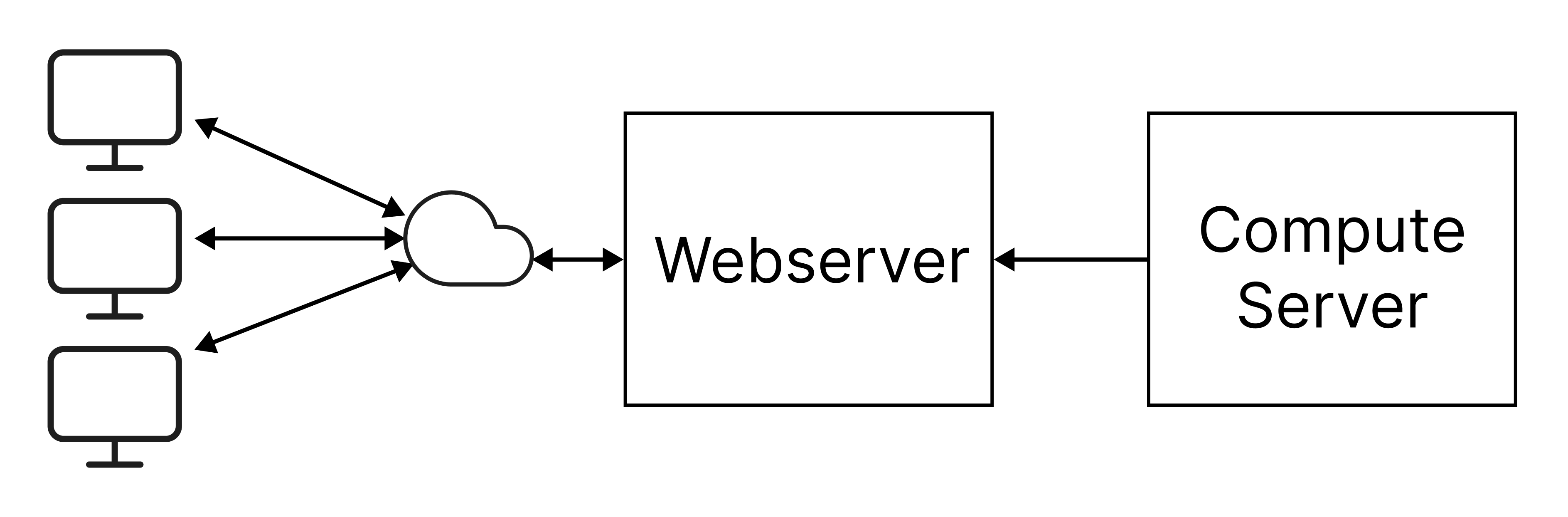
Such a system is employed in the RAT-Mekong dashboard. In it, time-series plots are generated in the compute server, which are then sent to a static webserver that hosts the RAT-Mekong website.
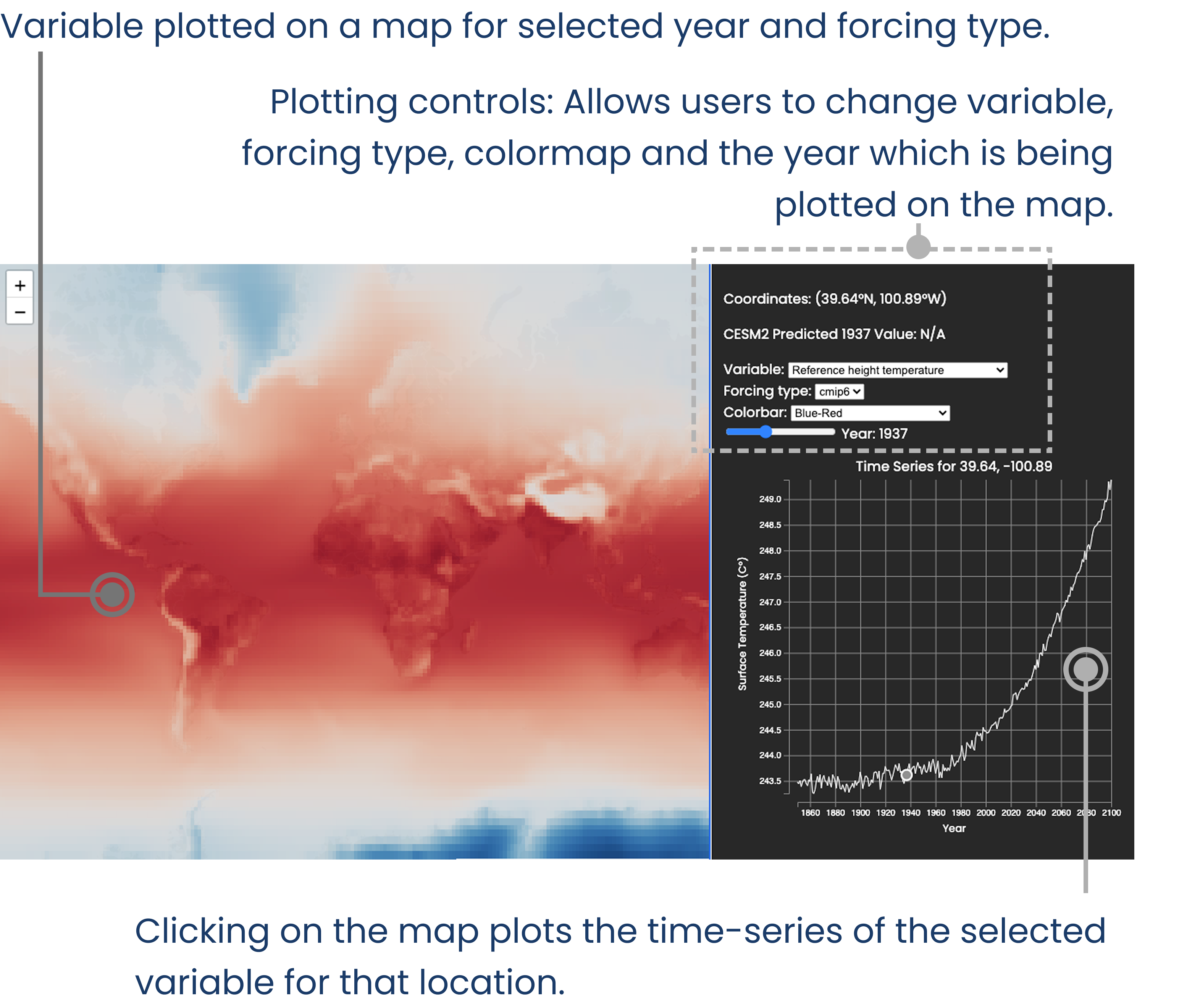
Strategy 2: Use an existing toolset: HoloViz
Another strategy can be using an existing toolset that allows for building and serving interactive dashboards.
HoloViz is one such toolset in the python ecosystem. Users in the scientific domain, especially in fields of climate science, remote sensing, etc., are likely familiar with python and tools such as xarray, pandas, bokeh etc. The HoloViz ecosystem of tools mesh really well with these familiar tools. Hence it is an ideal choice for scientists who want to spin up a dashboard for users.
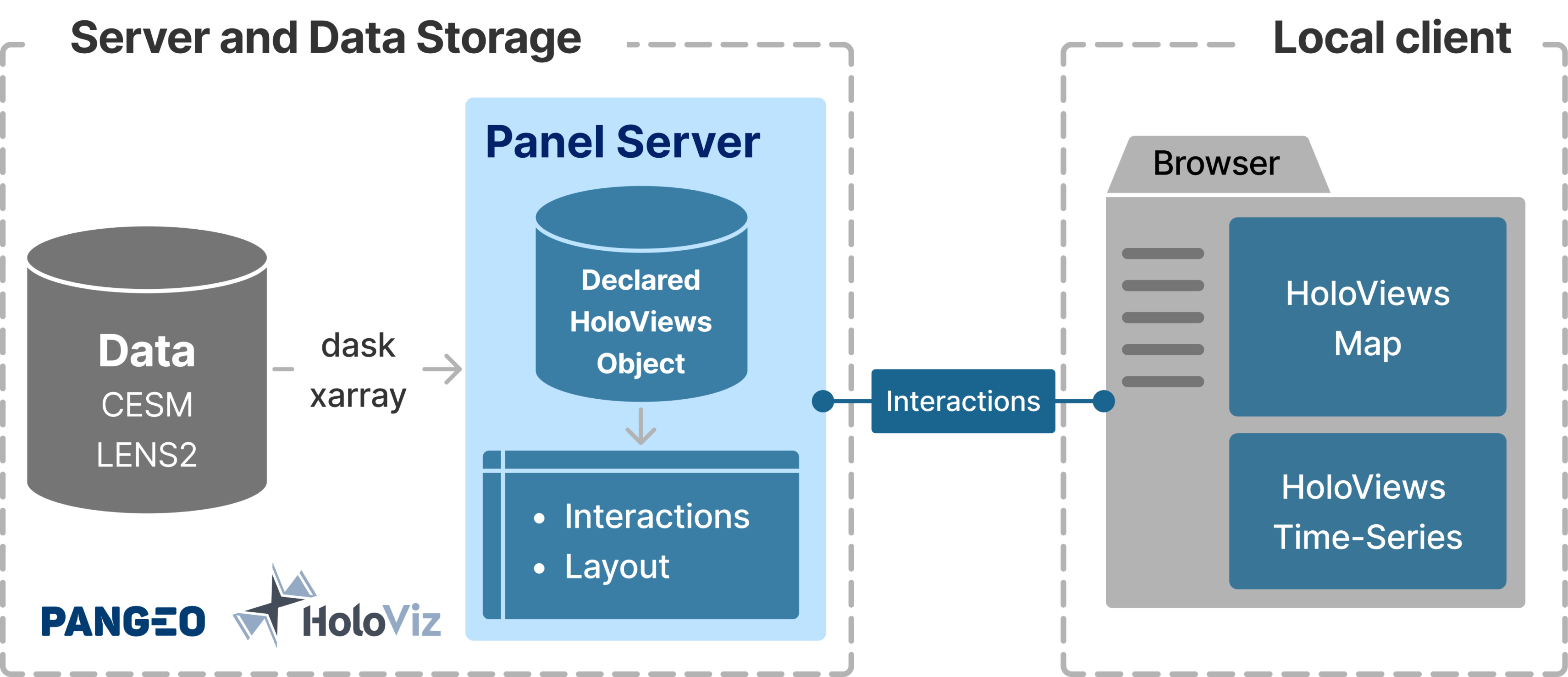
In such a system, the plots are generated and served (with interactivity) using tools in the HoloViz toolset.
This method of making a dashboard results in a hassle-free setting up of a server. The plots are generated using tools like HoloViews and Panel. These plots are served using Panel, which can also handle user inputs in the form of interactions (panning, zooming, clicking). While panning and zooming don’t require any additional coding, changing variables through dropdown menus and clicking on a map (plot#1) to update a time-series (plot#2) require some additional configuration.
Essentially these interactions, such as updating a dropdown menu, sends a signal to panel server running in the backend. Once received, appropriate changes to the plot can be made. For example, if initially “surface temperature” is being plotted by selecting the variable using ds['surface-temperature'], changing the dropdown menu’s value will update the selection appropriately. Full code example, sample code below –
@param.depends('variable')
def get_map_data(variable):
  # assuming that the data for each variable is
  # stored as a DataArray in the ds DataSet
  subset = ds[variable]
  subset_hv = hv.Dataset(subset)

  # the function will return a holoviews-wrapped
  # dataset that can be used to generate plots
  return subset_hv
The code written for the dashboard can be accessed at negin513/CESM-LENS2-Dashboard.
Strategy 3: Build a custom server-client solution
Finally, a completely hands-on approach would be to built the entire server-client stack by ourselves.
The backend server would comprise of tools that can serve the data on request.
- uvicorn: Handles requests from users’ browser.
- FasAPI: To serve data subsetted by user inputs. Eg: If a user clicks on lat-long, send the time-series data at that location.
- xarray, dask: To read the data on disk (netcdf/geotiff) and subset in a performant, parallel manner.
The frontend code would handle the user interactions (like zooming, panning etc.), and send appropriate requests to the backend requesting data for visualization.
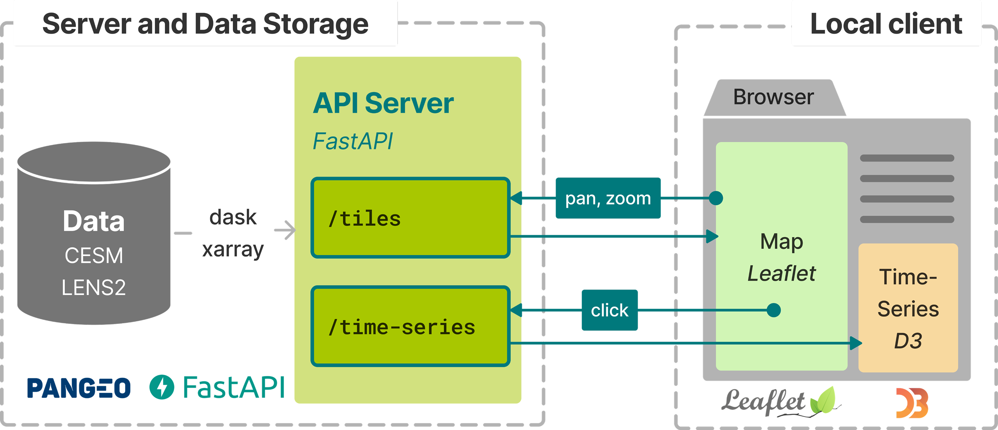
For instance, the /tiles endpoint of the server depicted in the figure above lets the frontend request data within a bounding box defined by [xmax, ymax, xmin, ymin]. It can be achieved using the following code (for full code, visit this link).
app = FastAPI()

async def get_tile_data(
  xmin: float,
  ymin: float,
  xmax: float,
  ymax: float
  ) -> pd.DataFrame: # code...
  pass

@app.get("/tiles/{xmax}/{ymax}/{xmin}/{ymin}")
async def get_tile(xmax, ymax, xmin, ymin):
  xmin, ymin, xmax, ymax = [float(n) for n in (xmin, ymin, xmax, ymax)]
  xmin_m, ymin_m = lnglat_to_meters(xmin, ymin)
  xmax_m, ymax_m = lnglat_to_meters(xmax, ymax)

  # reads the data from dis

  data_subset = await get_tile_data(xmin_m, ymin_m, xmax_m, ymax_m)

  data_df = data_subset.to_dataframe().reset_index()

  cornerpoints = (xmin_m, ymin_m, xmax_m, ymax_m)

  json_data = {
  'data': data_df.to_json(orient='table'),
  'cornerpoints': cornerpoints,
  'colorlim': COLORLIM
  }

  return Response(
  content = json.dumps(json_data),
  media_type="application/json"
  )
Say a user zooms into a region of the map, the frontend invokes the tiles/ endpoint by sending the bounding box coordinates of the updated view as a HTTP request to server_address/tiles/<xmax>/<ymax>/<xmin>/<xmax>.
The server receives the coordinates and uses it to call the get_tile function. It extracts the data from the underlying file, converts it into a format that is readable by the frontend, which is used to complete the visualization in user’s browser.
We built the dashboard using uvicorn+FastAPI+xarray+dask in the backend, and d3.JS in the frontend.
Full code of the backend can be found in this repository. Full code for the frontend can be found in this repository.
Conclusion
Working with large raster data can pose challenge due to it’s size, not only during processing the data but also to create visualizations. Creating interactive visualizations where data loaded on memory must change in respose to user interactions pose even larger challenge. This post discusses a few ways in which a user-facing interactive dashboard can be made. Three strategies are discussed, (1) where visualizations are pre-computed, stored as html files, and served by a static webserver, (2) a toolset is used to create the visualizations and handle the interactions, and (3) a custom server-client approach. The benefits and drawbacks of each strategy are tabulated below:
| Approach | ✅ Pros | ❌ Cons |
|---|---|---|
| Static Webserver | - 🧱 Simple static style websites - 📊 Good for static dashboards - 💪 Offloads processing to capable servers - 🚀 High-throughput server handles access | - 🗃️ Website can become large - ⚙️ Limited customization - 😐 Not elegant |
| HoloViz | - 📦 Built-in interactive visualization - ⚡ Easy dashboard setup - ☁️ No-hassle publishing | - 🔌 Needs a server running - 🔒 Locked into one ecosystem |
| Custom Client-Server | - 🛠️ Highly customizable - 🚅 High performance | - 🧩 Complex setup - 🧠 Requires multi-tech expertise |
This project stems from the work I did during the Summer Internships in Parallel Computational Science (SIParCS) program at NCAR. This work was presented at AGU-2023